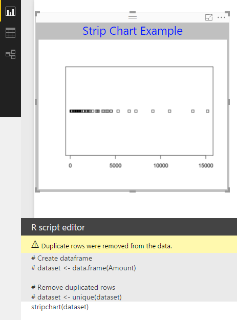
This is a basic chart available in Power BI using R Script. It produces a plot of data, withe each data point a small rectangle along a single axis. The input required for this is just one column of data.
Here is an example of a strip chart of financial data with the Amount column in a table plotted along a line.
Source of data: SAP SQL Anywhere 17
Power BI: August 2016 Update
 R Script for this is: straipchart(dataset) for the dataset shown in the image.
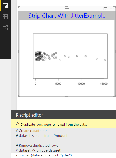
You can add a method to the above to show some separation between the data points as in the next image.

Here is an example of a strip chart of financial data with the Amount column in a table plotted along a line.
Source of data: SAP SQL Anywhere 17
Power BI: August 2016 Update
You can add a method to the above to show some separation between the data points as in the next image.


No comments:
Post a Comment