This kind of data plot is required while showing statistical analysis
of distributed financial data. It is usually called Box plot and
sometimes Box and Box & Whisker plot.
Here is an example of how it looks:
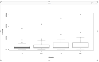
BoxPlot_00
The plot represents some Financial data (Amount) over 4 quarters for three years.
The details of what the plot shows is in the next image:

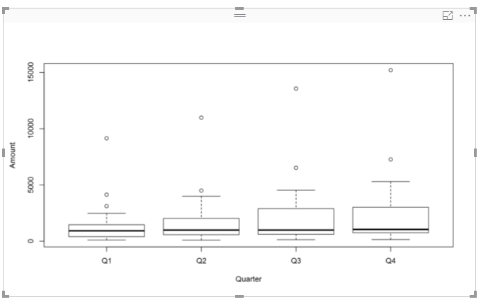
BoxPlot_01
Here are the details of this plot:
This data is from the demo database on SAP SQL Anywhere 17 server. The data visualization is carried out by using R Script in Power BI.

Here is an example of how it looks:
BoxPlot_00
The plot represents some Financial data (Amount) over 4 quarters for three years.
The details of what the plot shows is in the next image:

BoxPlot_01
Here are the details of this plot:
This data is from the demo database on SAP SQL Anywhere 17 server. The data visualization is carried out by using R Script in Power BI.


No comments:
Post a Comment